
Executive Summary
Creating an Agent Dashboard
Teams were struggling with fragmented, unreliable data. Everything was passed between people manually with no single source of truth. I led design from scratch, working closely with developers from day one to translate messy existing workflows into something clean and intuitive. The goal was always to feel familiar, not foreign. We ended up cutting task completion time by 54% and landed an 88% satisfaction score.
Primary Role
Developers
Team
5 x Developers
1 x Product Manager
Type
Product Design
Disciplines
User Research, UX/UI
The Challenge
Replacing Legacy Methods with a Digital Source of Truth
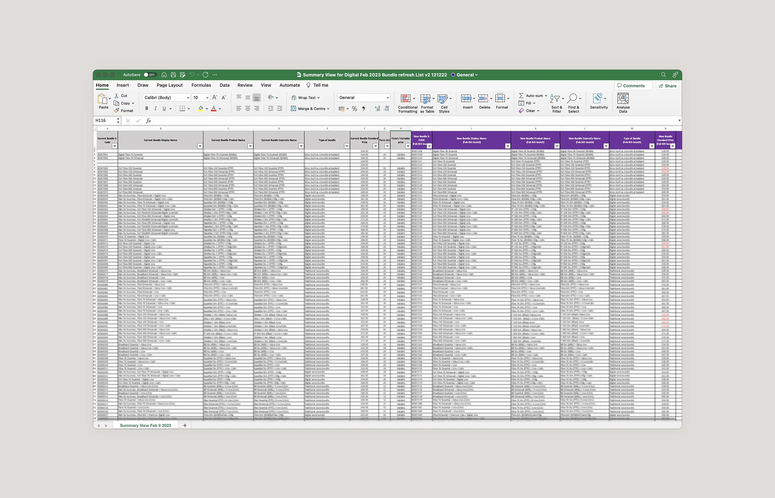
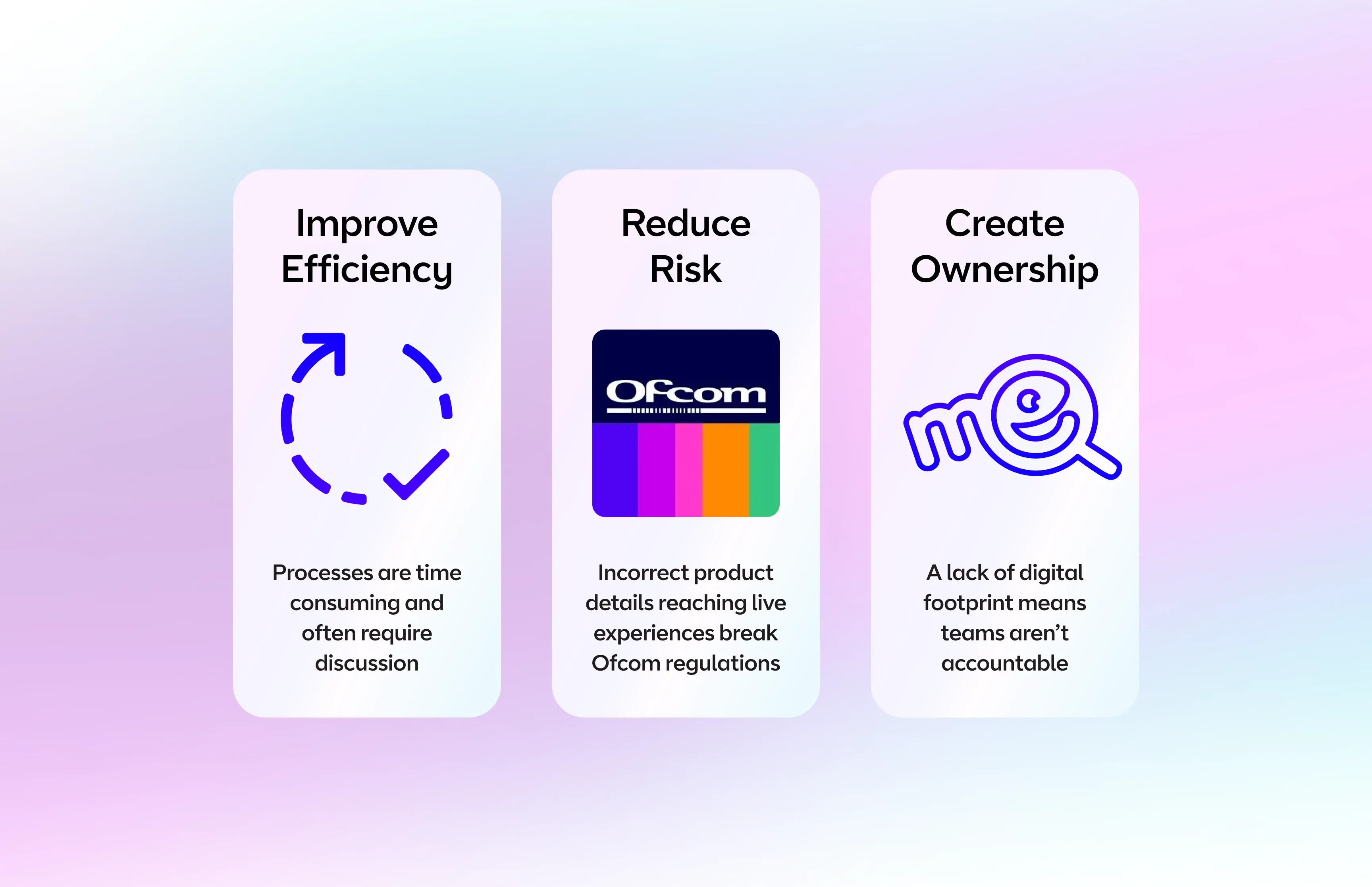
Many issues were emerging in how teams passed, stored and communicated business data. Both the relevance and accuracy of information were unreliable. We needed to design a dashboard application to serve as a central reference point for the whole business, combining multiple information streams, modernising the underlying architecture, and replacing manual processes with a scalable digital system. The highly technical nature of the project meant working closely with developers from the earliest stages of discovery.
The Research
Deep Stakeholder Research to Mirror Workflows
As an internal tool affecting a wide range of stakeholders, it was vital we understood core user needs and existing workflows before designing anything. We spoke to representatives from every stakeholder group to gather insights. To maximise adoption, we designed closely to existing manual processes, translating them into digital form rather than introducing entirely new behaviours. Building on established familiarity reduced the learning curve significantly and gave stakeholders confidence in the new system.
The Design
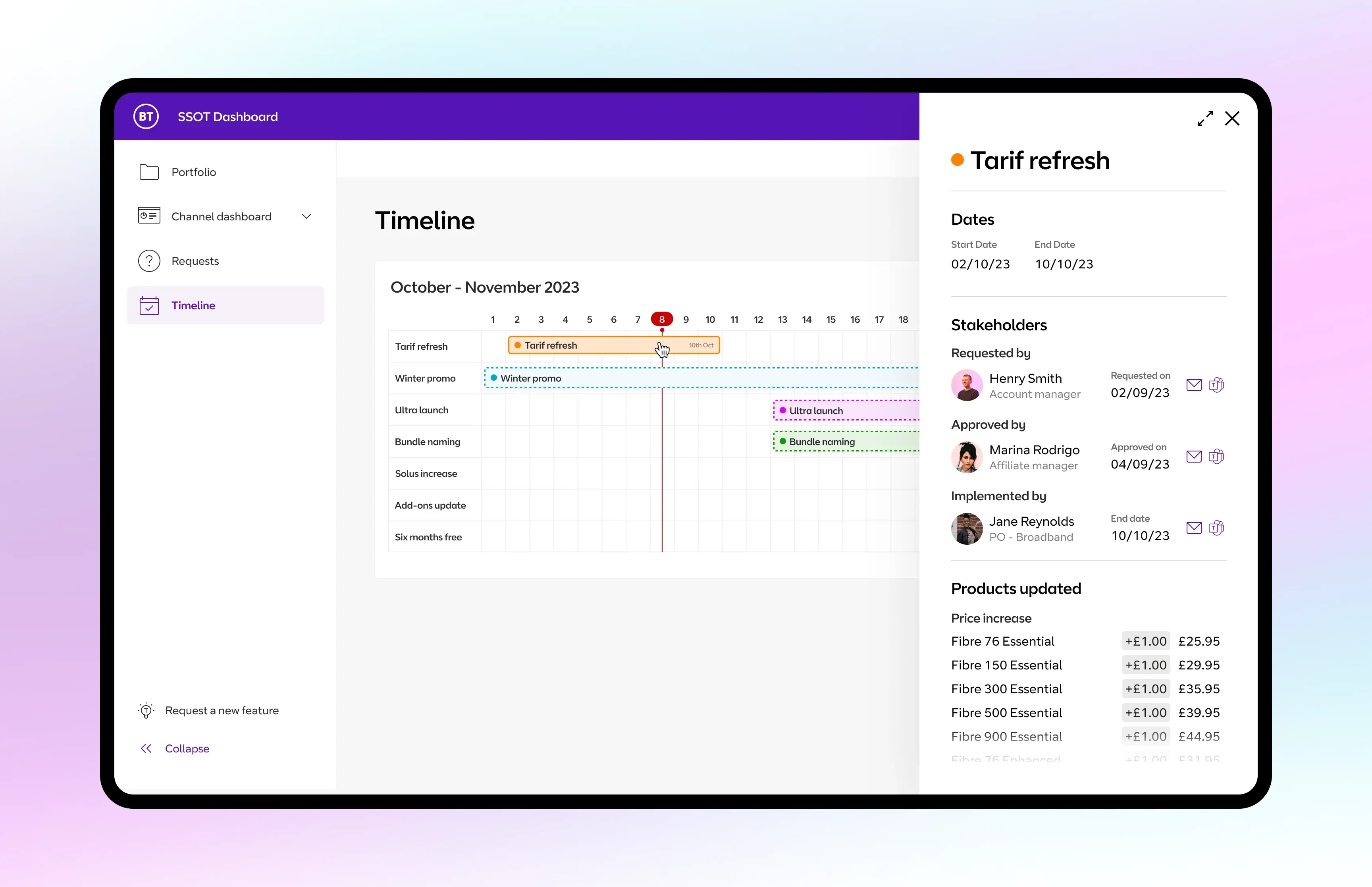
Functionality First Design for Information Clarity
Establishing a clear typographic hierarchy, varying font weights and colours to differentiate key information, proved immediately effective. Table formatting techniques let us present data in a scannable, user-friendly way. Crucially, interaction choices were driven by usability rather than visual appeal, keeping the tool purposeful and fast to navigate. Layering in interactions for practical benefit rather than aesthetic effect kept the experience grounded in what agents actually needed.
This dashboard has transformed how I work. It's clear, intuitive, and everything I need is right at my fingertips. I can focus on what matters without getting bogged down in clunky systems. It feels like the business finally understands the way we need to work.
Outcome
Satisfaction
Task time
